How A/B Testing Cued to Drive Subscription Growth
-
Product Type
B2C -
Platform
Mobile -
Timeline
4 weeks

Background
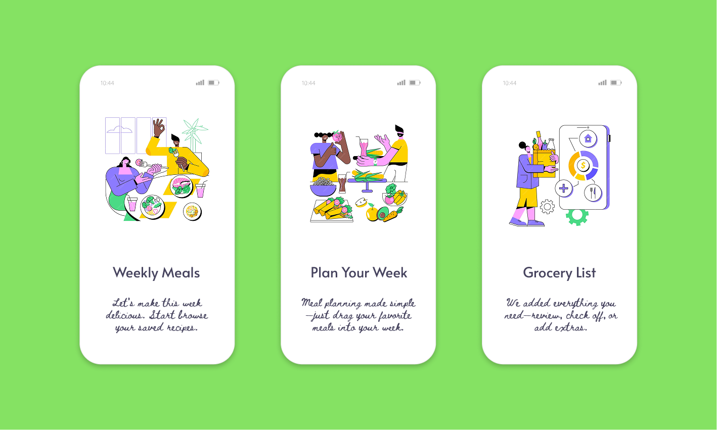
The app offers weekly meal planning, recipe browsing, and grocery delivery integration. A core feature — the Weekly Meal Planner — allows users to plan meals day-by-day and unlock advanced capabilities (like auto-scheduling, nutrition insights, and smart grocery lists) with a premium subscription.
Despite high engagement in the planner, conversion to premium remained flat at 4.5%. Usability testing suggested users enjoyed the planning flow but didn’t fully understand the value of upgrading.
Problem
Although the app had good download rates and initial engagement, conversion to paid subscriptions was stagnant at around 4.5%.
Observation
User behavior data showed that most users dropped off right after using the Planner feature, even though it was the app’s core value proposition. Interviews revealed confusion about how to finalize a plan or what benefits the premium plan offered.
A/B Testing Strategy: Improving the Weekly Plan UX and Paywall Flow
Hypothesis:
If users better understood the value of unlocking advanced capabilities by subscripting to premiun, conversions would increase.
Variants Designed:
A - Control
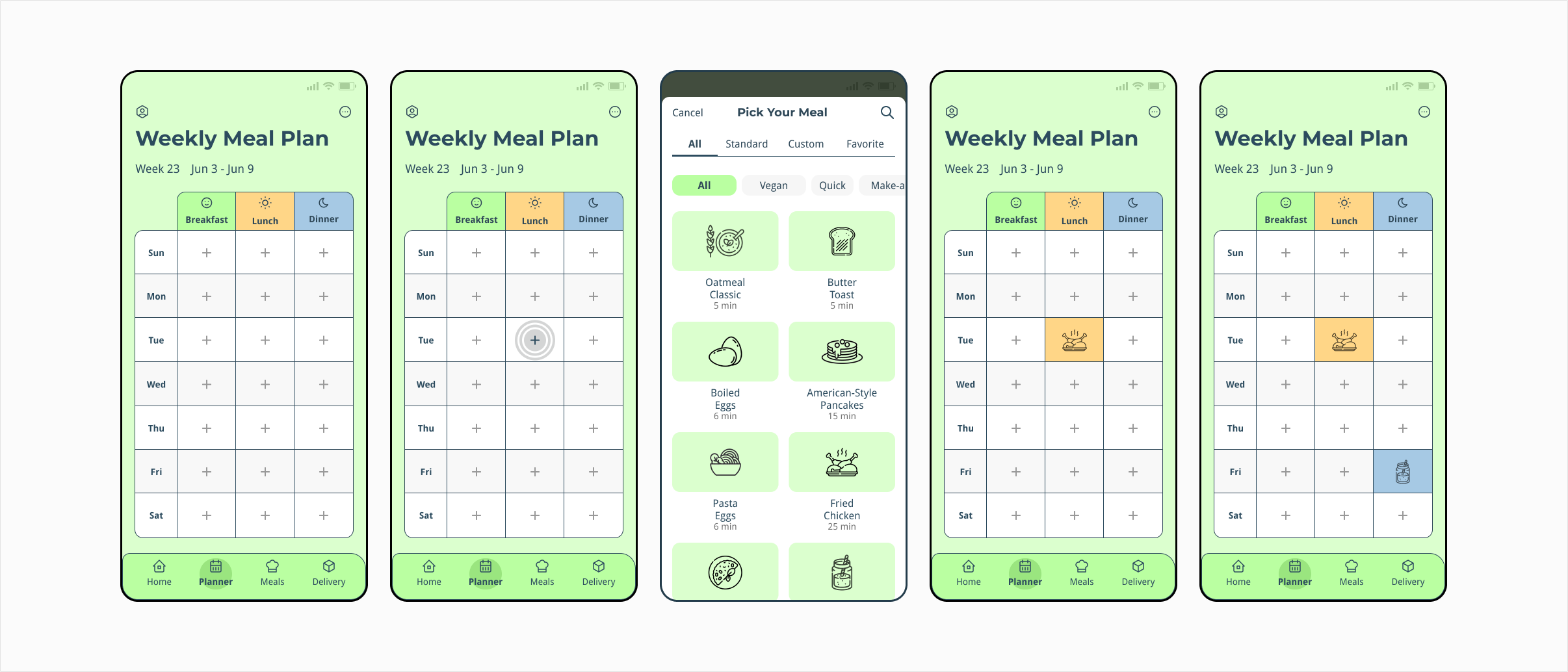
Design A featured a clean, well-structured planner UI. The design emphasized manual control, giving users a 7-day calendar with three meal slots per day (breakfast, lunch, dinner). The experience was minimal and efficient — no distractions, no promotional prompts.
Key features:
- Manual meal selection via “+” icons per slot.
- Full-screen meal search modal with recipe filters.
- Static header and calendar grid.
- Subscription upsell shown only in Settings, or after attempting to use a locked feature (e.g., export plan).
Strenghts:
- Visually tidy and consistent.
- Easy to understand for users who enjoy full manual control.
Limitations:
- Premium value not obvious unless users stumble upon it.
- No visual or emotional differentiation between free and paid features.
- Lacked momentum for new users — no onboarding or suggestions.
Design B (Test Variant): Strategic UX Enhancements
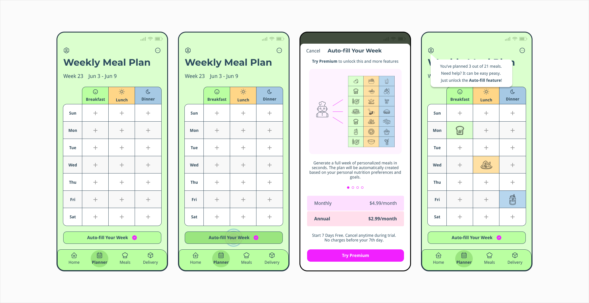
Overview
Design B retained the visual polish and structure of Design A but added layered UX improvements to nudge behavior, highlight premium benefits, and enhance discoverability — without feeling salesy or disruptive.
Key Improvements:
- A button labeled “Auto-Fill Your Week” prompting curiosity.
- ‘Try Premium’ is available right here — no need to open the main menu.
- A carousel that highlights what user will get by unlocking the feature.
- A tooltip shows how many meal slots the user has filled (e.g., “You’ve planned 4 of 21 meals – Need help?”). Clicking “Need help?” opens the premium auto-fill option.
- Visual illustrations to enhance user understanding and improve onboarding.
A/B Test Results
30-day test, 20k users
Key Takeaways
- Good design isn’t just about polish — it’s about momentum.
- Upgrade prompts work best when embedded naturally into the experience.
- Don’t hide the upgrade option — show it in place.
- Letting users preview value before commitment drives trust and curiosity.


