Healthyze
Case study
Introduction
A case study how I helped a company to fully redesign and modernize their healthcare product
Background
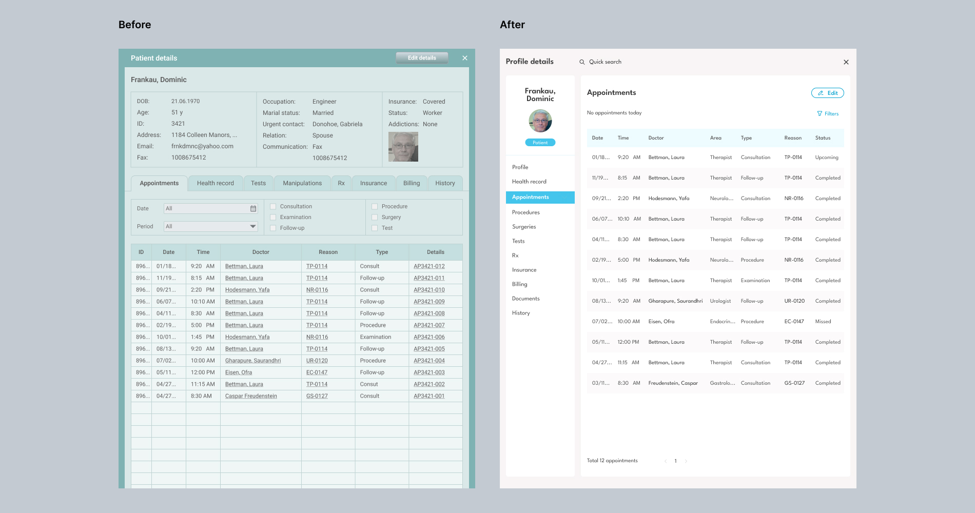
The product - an electronic health record system (EHR)-allowed healthcare providers to manage patient records, appointments, billing, and internal communications. The system has been in use for about a decade and started to face numerous issues like outdated user interfaces, lack of modern features and customer transition to competitors' products.
My role
I joined the team at a time when the product problems became quite noticeable and comprehensive measures were required. I was invited to organize and lead the full redesign process. This included a complete revision of the interfaces, functionalities and features. Along with that, it was supposed to strengthen the product with modern technologies such as AI.
My responcibilities
- Oversee product redesign - Strategy and roadmap - Lead the product team - Manage product backlog - Research
Product team
- 1 Product Owner - 1 Marketer - 1 Visual designer - 1 UX/UI Designer - 3 Front-end Developers - 1 iOS Developer
A good start is half the story
A B2B product redesign is not as easy as it seems. It is not enough to simply redraw buttons and forms in new colors or change icons. This is a complex process that covers many product and UX/UI design aspects. I had to properly plan and organize the team's work so that it would be consistent with the company's goals and lead to the successful implementation of the project.
I realized that the team and the company expected a clear redesign strategy, comprehensive guidance, and help with practical tasks. Even so, it was important to start off right. I believe that a great start is when you and your team define the problem from various angles, discuss all the painful issues and share your opinions on how it should be the best.
To understand the product I needed to know as much as possible about the ‘why’ and the ‘what’. I held preliminary meetings with the team, where we clarified everything related to the product: history, goals, customers, market situation and the project expected result.
Introduced to the people my plans
The team had no experience of how to do a complete redesign of a product. Basically, the team performed fragmented tasks as requests came in from customers or were set by the product owner. The colleagues needed help to cover everything and focus their efforts in the right direction.
Redesign roadmap
Based on the company's goals and project expectations, I elaborated a roadmap for the redesign, with phases and estimated dates. The timeline was based on an expected 8-month iterative, non-linear redesign process. The timelines could vary depending on resources, complexity, and scope.
Phase 1: Discovery and requirements gathering Objective: Understand the scope of the redesign and gather requirements from stakeholders Tasks: Conduct meetings with stakeholders Collect feedback on current system issues Define key performance indicators (KPIs) Outline new and specific features needed
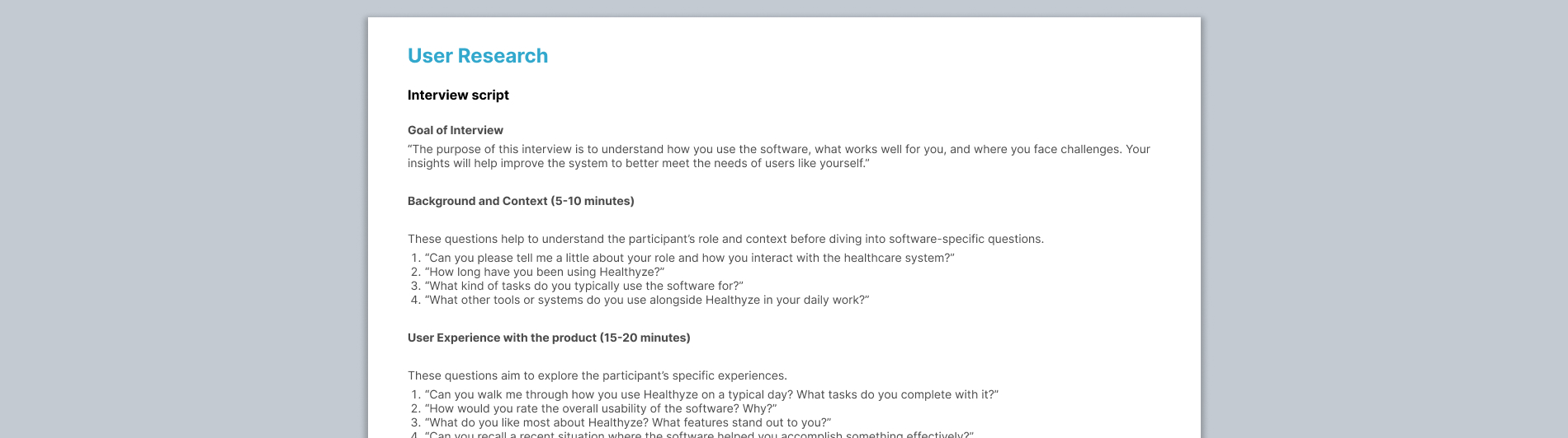
Phase 2: Research and Analysis Objective: Analyze existing systems, competitor products, and industry trends Tasks: Interview users and healthcare professionals Research latest healthcare tech trends and standards (HL7, FHIR) Study EHR user interface and user experience best practices Define advantages of competitors' products that attract users Identify regulatory requirements (HIPAA, HITECH Act) and security protocols Create user personas
Phase 3: UX Architecture and UI Design Objective: create mockups/prototypes. Develop product's new visual style Tasks: Create wireframes Develop graphic design concepts Build Design System Set up a feedback loop with key stakeholders for approval
Phase 4.1: Development (Backend and Core Features)
Phase 4.2: Development (Frontend UI and UX)
Phase 5: Quality Assurance and Testing
Phase 6: Deployment and training

Research exposed the picture
From my experience, research always reveals many unexpected findings you haven't supposed before. You can spend as much time as you want talking to your stakeholders and your team. But when you go outside to your customers and users and ask questions, you learn a ton of new things. When you look at your competitors' solutions, you find more new ideas than expected.
That was the case this time. After conducting research, I saw a much bigger picture and brought the team a ton of interesting facts, discoveries and thoughts. Here are some of the key unexpected insights:
- Finding: more communication. The customers I interviewed were happy to share their experience on using the product. Before this, the company rarely communicated with them in such depth, mainly responding to their requests
- Finding: resistanse to change. The company thought the healthcare professionals (doctors, nurses) might express reluctance to adopt new technologies. In fact, despite the conservative profession, the users very willingly expected modern features - for example, AI-based
- Finding: manual processes over automated. Users often develop workarounds using paper or non-integrated tools to fill gaps in the product's capabilities
- Finding: data privacy. Even when the software complies with regulations like HIPAA (in the U.S.), users might still have concerns about data privacy or the security of sensitive information
- Finding: inconsistent user experience. Since the company had been constantly refining its product, each functional update seemed to be built on the previous ones. Users got the impression of patchworking
- Finding: outdated user interface and prodict style. Such is the psychology of perception - even if the product works well, but looks graphically outdated, users begin to doubt its advantages
- Finding: Misalignment with Actual Use Cases. Some users might use the software differently than how the developers envisioned. Such as prioritizing features that were not considered core to the initial design.
Helped the team to focus
Focusing the Product Team was critical to ensuring that colleagues are aligned, motivated, and working effectively towards common goals. Here is what I did to help the team to stay focused:
- Defined clear goals. Prioritized tasks
- Communicated a product vision and involved the team in the vision
- Ensured cross-functional and cross-team collaboration
- Implemented Scrum activities (daily standups, demos, retros)
- Regularly reviewed customer feedback, data, and insights
- Limited scope creep. Regularly reviewed new feature requests
- Empowered and trusted the team. Gave the team members autonomy and allowed for ownership
- Tracked progress and celebrated wins
User experience is a base
The Product Team saw the redesign more as the product's graphic style revamping. There was some truth to that. However, UX still remains a cornerstone because it directly impacts how users interact with the system. Plus, UX design is based on understanding the needs, preferences, and limitations of the users. UX design involves solving complex problems, such as how to make tasks more efficient or streamline processes.
Therefore, I believed it was necessary to do the UX redesign in parallel, if not one step ahead of the graphic style alteration. As mentioned above, before I joined the team, we did not have a UX designer, so I suggested including such a specialist in the product unit. After all, product design never ends as it is constantly being improved, so a permanent UX designer in the team would be needed for a long time.
I also conducted several trainings with the team, where colleagues updated and expanded their knowledge of design thinking and user-centered approaches, UX design methods, interaction engineering, and so on.

Lean UX for minimizing wasted time
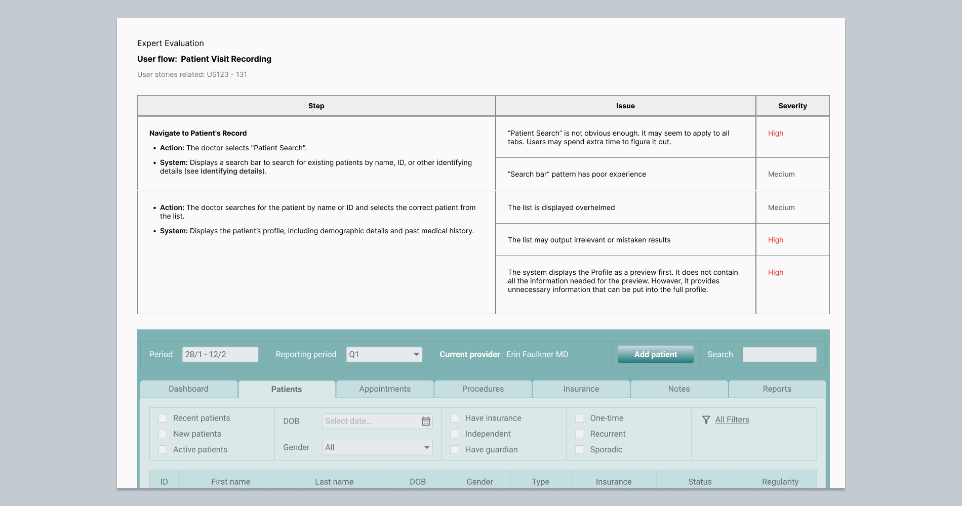
We were limited in time and resources and there was not enough time to deliver long-running UX design achievements. Plus, the engineers developed the back- and front-ends at a fast pace, so it was necessary to keep up with them. Therefore, I decided to follow Lean UX so we could obtain feedback as early as possible to make quick decisions. We worked in rapid and iterative cycles and produced changes that improved the product's experience progressively faster.
As the system was quite large, it was not possible to redesign and improve all the UX in one project. We decided to focus on the most important and critical flows, features, and problem areas. I did the task prioritization and managed the backlog.
Wireframes visualised UX improvements
The designers were creating user flows and wireframes for key functionalities we selected to modernize. The wireframes and prototypes were iteratively improved based on user feedback.
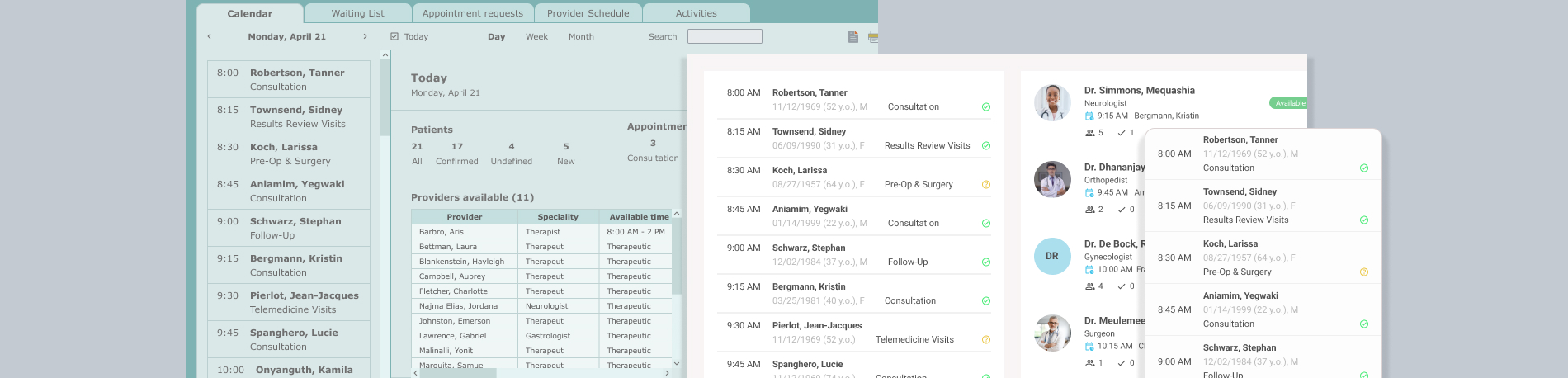
- Dashboards
- Navigation
- Appointment Scheduling
- Health Monitoring
- Patient/Doctor Profiles
- Customizable Templates
- Clinical Documentation
- Medication Management
- Billing and Reporting
- Audit Trails

Interactive prototype example
User Interface redesign went hand in hand with UX
In traditional product projects, UX design and graphic design are often separated. This means that UX designers first do research, then create personas and user flows, then build prototypes and finish by testing. And at the very end, when the UX architecture is ready, graphic designers get involved.
In the given project, I combined these directions, so they went relatively parallel. For example, while the UX designers were making prototypes, the graphic designers were already working on graphic concepts, choosing colors, fonts, icons, and coming up with the overall style of the product.
This had a positive effect because we were able to get more complete feedback from users and stakeholders immediately, without having to go back and forth with updates.
Metrics allowed to touch the result
Okay, the product was redesigned, developed and its new version tested with users. Was it possible to measure the result? Yes, it was. We could use both design and product metrics (key performance indicators (KPIs)). And we found that our efforts were rewarded!
Design metrics:
- User Satisfaction: average rate 9 on a unipolar scale of one to ten, where ten is 'absolutely, conclusively satisfied'
- Completion Rate: 87% as the level of successfully completed tasks
- Error Rates: as shown by tests, 0.8% (where ≤ 1% is good, up to 2% is acceptable)
- Time Efficiency: we measured the time it took for users to complete common tasks (scheduling, billing, patient intake forms filling in). The average rate decreased by at least half (compared to the old design)
- Data Accessibility: the time it took to access important patient data decreased by one third (as measured by the key user flows, compared to the old design)
Product metrics:
- Active Users: DAU growth from 19% to 41% of MAUs (compared to the old design)
- Feature Usage: for core features, growth from 79% to 86%
- New Feature Adoption: 39% (good rate)
What I learnt
- Align on a Shared Vision
It’s essential that everyone in the team understands the overarching goal of the redesign and what success looks like - Set Measurable Objectives: Establish clear, measurable goals (KPIs or metrics) to track progress.
- Leverage Diverse Expertise: A successful redesign benefits from diverse perspectives.
- Regular Check-ins
- Ensure Data-driven decision-making and feedback loops
- Start Small, Scale Gradually: Begin by redesigning a small, manageable piece of the system before tackling the entire redesign
- Foster a Collaborative Culture
- Plan and Have a Strategy
- Celebrate Success